Feature Overview
Redesigned Workflow Statistics is an update to the Synerise Automation module that replaces the previous statistics experience with a rebuilt visualization system. Performance data is now displayed directly on the workflow canvas, with adjustable time ranges, per-node heartbeat charts, dedicated statistics panels in node details, and campaign-level metrics for sending nodes.
The redesign allows users to monitor, validate, and optimize workflow execution without navigating away from the editor. All statistics are presented on an interactive timeline for identifying patterns, spikes, and anomalies.
What Is Redesigned Workflow Statistics?
Redesigned Workflow Statistics is a rebuilt statistics system within the Synerise Automation workflow editor. It displays execution data, trends, and campaign metrics directly on the workflow canvas and inside individual node detail panels. The system replaces the previous statistics implementation with a new architecture designed for inline monitoring and time-range-based analysis.
Each workflow node now includes a heartbeat visualization (a simplified inline chart of executions over time) and a dedicated statistics section accessible from the node details panel. Sending nodes (email, SMS, push) additionally include campaign-specific statistics such as delivery and engagement metrics.
Why Redesigned Workflow Statistics Matters
Before this update, reviewing workflow performance in Synerise Automation required navigating between different views or tools. This created friction when monitoring active workflows or troubleshooting execution issues.
Redesigned Workflow Statistics addresses this by:
- Displaying execution data directly on the canvas, eliminating context switching between the editor and reporting tools
- Providing per-node heartbeat charts that give an at-a-glance indication of whether each step is running normally
- Supporting adjustable time ranges (from the last hour to the last 7 days) directly on the canvas
- Including campaign-level delivery and engagement metrics on sending nodes, so communication performance is visible in context
- Presenting all data on an interactive timeline for identifying execution patterns and correlating them with external events
Key Capabilities
Adjustable time range on the canvas
Users can change the time range of statistics displayed on each node directly from the workflow canvas. Options include snapshots of the last hour or trends over the last 7 days. The data adapts to the selected range without requiring navigation to a separate reporting view.
Node heartbeat visualization
Every node in the workflow now displays a heartbeat — a simplified inline chart showing execution volume over time. The heartbeat provides a quick visual indicator of whether the node is operating normally or requires attention, without opening the node details panel.
Dedicated statistics in node details
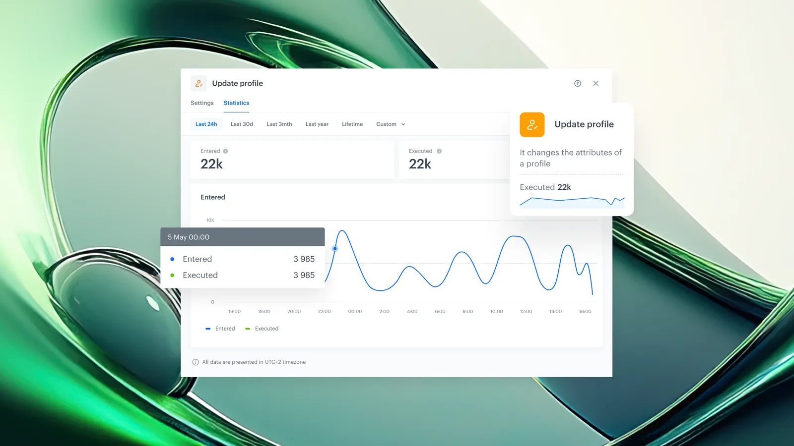
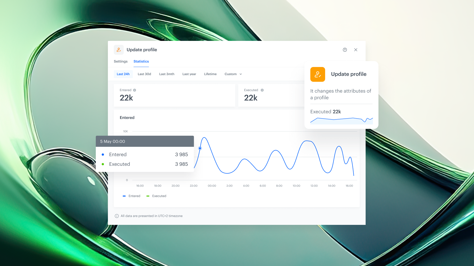
Opening any node's details panel reveals a dedicated statistics section with execution counts, trends, and patterns. Users can drill into performance data for individual nodes without leaving the workflow editor.
Campaign statistics for sending nodes
Sending nodes (email, SMS, mobile push) include a dedicated campaign statistics section. This section displays delivery rates, engagement metrics, and performance data specific to the communication step, providing campaign-level insights directly in the workflow context.
Statistics on an interactive timeline
All statistics are presented on an interactive timeline that supports identifying spikes, drops, and anomalies across any time period. Users can visualize execution patterns and correlate them with campaign events or external factors.
How Redesigned Workflow Statistics Works
- Open an existing workflow in the Synerise Automation editor.
- View the heartbeat chart displayed inline on each node, showing execution volume over time.
- Adjust the time range selector on the canvas to change the period displayed (e.g., last hour, last 24 hours, last 7 days).
- Click on any node to open its details panel and access the dedicated statistics section with execution counts and trends.
- For sending nodes (email, SMS, push), review the campaign statistics section showing delivery and engagement metrics.
- Use the interactive timeline to identify spikes, drops, or anomalies and correlate them with campaign events.
Example Use Case
A marketing team deploys a new welcome email workflow in Synerise Automation. After activation, the team opens the workflow editor and immediately sees heartbeat charts on each node. They notice the email sending node shows a spike in executions followed by a drop. Without leaving the editor, they adjust the time range to the last 24 hours, click on the sending node, and review the campaign statistics section. The delivery rate shows a temporary dip caused by a provider throttle. The timeline visualization confirms the pattern resolved within two hours. The team validates that the workflow is performing normally without switching to a separate reporting tool.
FAQ
What is the node heartbeat in Synerise Automation?
The node heartbeat is a simplified inline chart displayed on each workflow node that shows execution volume over time. It provides a quick visual indicator of whether the node is running normally or requires investigation.
Can workflow statistics time ranges be adjusted without leaving the editor?
Yes. The time range selector is available directly on the workflow canvas. Users can switch between ranges such as the last hour, last 24 hours, or last 7 days without navigating to a separate view.
What campaign metrics are available on sending nodes?
Sending nodes (email, SMS, mobile push) include a dedicated campaign statistics section that tracks delivery rates, engagement metrics, and performance data specific to each communication step.
Does Redesigned Workflow Statistics require additional configuration?
No. The statistics are automatically available on the workflow canvas and in node details panels for all workflows in Synerise Automation.
Is the statistics architecture extensible?
Yes. The redesigned statistics system is built on a new architecture intended to support additional metrics, deeper drill-downs, and expanded monitoring capabilities in future releases.
Key Facts
| Attribute | Value |
|---|---|
| Feature | Redesigned Workflow Statistics |
| Product | Synerise |
| Module | Automation |
| Purpose | Display workflow execution statistics directly on the canvas with per-node heartbeats, adjustable time ranges, and campaign-level metrics |
| Visualization types | Node heartbeat charts, interactive timeline, campaign statistics panels |
| Time range options | Adjustable (last hour to last 7 days) |
| Sending node metrics | Delivery, engagement, and performance per communication step |
| Configuration required | None (automatic) |
Related Concepts
- Synerise Automation workflows
- Workflow monitoring and observability
- Campaign performance analytics
- Email, SMS, and push delivery metrics
- Real-time workflow execution tracking
TL;DR
Redesigned Workflow Statistics is a rebuilt statistics system in Synerise Automation that displays execution data directly on the workflow canvas. Each node includes a heartbeat chart for at-a-glance monitoring, a dedicated statistics panel in node details, and campaign-level metrics on sending nodes. Users can adjust time ranges, drill into per-node data, and identify anomalies on an interactive timeline — all without leaving the workflow editor.